A2 Media Coursework
Wednesday, 15 December 2010
Thursday, 9 December 2010
Newspaper Advertisement - 'City News'
Above is my final advertisement for our newspaper 'City News'. Following the advertisement for the social networking site twitter on the front cover of the newspaper, I believed linking this poster to technology and the broad acessibility of our local newspaper was imperative to luring in the working professionals as well as teenagers, adults and the older generations to access our local news. Through the use of photoshop I edited icons for facebook, and twitter as well as email and newspaper icons that follow a blue colour scheme to slant forward to look asif they are appearing to come out of the page to lure the reader in as they are eyecatching. It also conveys to the reader the variety of ways that they are able to access their local news that they are presenting them with, and also that as a company we are able to understand that technology is developing to an extent that we are now able to access news online, on our mobile phones as well as in the newspaper. I used a raw image (shown below) and used photoshop to manipualate the background to be fitting with the style and compostition of the advert. The use of darker browns contrasts with the blues and red within the icons, slogan and title to allow these images and text to lure the audience in.
The slogan 'We're here, are you?' is effective as the us of personal pronouns 'we're' and 'you' allows the audience be lured into the rhetorical question and question themselves as to how they can access our local news. The text of the slogans being blue connotes honesty of our news that we are bringing to our target audience of Milton Keynes. Through audience feedback I had to make the blue darker and bolder as the background and use of the bright red logo was over powering both slogans used. However after making all of the fonts larger and the logo for MK News slightly smaller the composition of the text on the lower half of the advert is much more effective and eyecatching to lure the audience in. The use of our logo makes clear links between our products as it appears on the front cover of our newspaper as well as on this advert.
Monday, 29 November 2010
Newspaper advertisements - further analysis
The Guardian
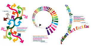
The Guardian released a series of advertisements, pictured above, to entice people into their newspaper. The bright colours that are shown on all three of the advertisements lure the audience in and can further help promote the newspaper. The colours could also be said to connote positivity of the events they may read about in the newspaper, but also vary considerably which could be said to reflect the content that the editors include in their newspaper.
The advertisement on the far left connotes all the different directions that people go in within society and they are represented by the multicoloured arrows. This could further connote the range of people within the target audience that the Guardian appeals to and their diversity. The middle advertisement could connote the variation of news and how each person hears about it differently whereas the final advertisement reflects the reasoning for people believing in fact or opinion and the consequences of newspapers publishing opinions instead of real facts within their content on the audience.
All of the slogans used help explain the plain, bright yet effective images the editors have decided to use. The language is simplistic and accessible through the use of short sentences yet it is still effective connoting the message of each advertisement. The personal pronoun of you is used in every one of the adverts which therefore lures the reader into the content and makes them think about the situation.
The Daily Telegraph
The Daily Telegraph
In using a simplistic layout, plain background and three images the Daily Telegraph have managed to create an effective advertisement for their paper. The plain background connotes to the audience that this is a non-gender specific advertisement, appealing to both genders. The use of short captions underneath the close up photographs of people’s faces through time allows an open interpretation of the advertisement. The slogan ‘it pays to think big’ is concise but connotes a lexical field of positivity among the audience which could be interpreted to represent a positive, realistic view of news stories in the paper.
Analysis from our research into advertisements
From the research that we have undertaken to produce our own poster it has become apparent that if an advert is simple yet thought out well it could connote a variety of messages about our newspaper and lure in a wider target audience. In our research of Milton Keynes and its development over the last 45 years, since its establishment, it could be said that there is a scope for a new newspaper because of the changes of the city in this time period and the expansion and development. Through this idea a poster could be formulated to convey the changes of Milton Keynes and to convey that our newspaper ‘City News’ has formulated itself from the news past, present and future. However, when thinking of how to photograph this idea I felt it wasn't possible to use my own raw photography, so I rethought my idea and I feel that one of our main target audiences is the working professionals. With the ever changing technology, a twitter advert featured on our front cover, I feel it appropriate to centre our advert around technology and all the ways people can keep up to date with 'City News' - online, twitter, facebook, email and the newspaper itself.
Friday, 5 November 2010
Updates
Within the past few weeks we have been working on putting our newspaper together using all of our previous research and knowledge. In doing this we chose our final layout designs (as shown below), wrote the stories, took pictures and began using photoshop to construct the advertisements.
I began by contructing a music venue advertisement for the second page of the newspaper. We chose to do advertise this due to our findings in our target audience survey. In doing this I used an existing logo of the 'Sno Zone' in Milton Keynes as I felt that I wanted to add some realism to the newspaper as the 'Sno Bar' I am advertising already exists. Using photoshop I edited the logo to change it from 'Sno Zone' to 'Sno Bar' to advertise the music venue. I then used my raw photography to advertise the band, once more using photoshop to enhance the images and the advertisement.
After this I then began constructing the newspaper using our logo which we had previously constructed using a raw image and text on photoshop. Using the codes and conventions of local newspapers we have studied we put together our news stories on the pages, which I wrote during the planning stages of the newspaper. I felt in doing this on photoshop that we were able to produce a more realistic newspaper style, however I found it difficult to produce the font size and style so that it reflected a conventional newspaper.
In doing this for both the front and second pages for the newspaper, our next tasks entail going to take pictures for our front page, editing a raw image for our second story to ensure the composition is effective and will lure the reader in. We also need to take pictures for our final advertisement and finalise the two adverts we have already began. After this we will then move on to our ancillary tasks.
Wednesday, 20 October 2010
Thursday, 14 October 2010
Monday, 11 October 2010
Subscribe to:
Comments (Atom)


